Post-Authentic Sincerity

✸ On realness, nature, and defaults in the context of graphic design

PART I:
A BRIEF BREAKDOWN OF AUTHENTICITY

✸ We often depend on a constructed real-fake binary to decode our world. We internalize different sensory associations with realness according to our belief systems. I argue that “authenticity” is a realness-descriptor that alludes to nature imagery, individualism, nostalgia, and the outside of consumer capitalism.

1.1 The Real-Fake Binary

✸ We break complex problems down into oppositional parts in order to comprehend them and find simple solutions. ✸ The real-fake binary is like the good-bad: These are fundamental structural elements of our value systems, but their representational forms are always subject to change. ✸ I understand realness to be an inherently intangible, imaginative value, but we associate it with sensory images of nature — whatever “nature” means in context. ✸ If we’re living in Mark Fisher’s “capitalist real”, that means our perception of reality is constructed by the dynamics of capitalism. The marketplace attempts to give “reality” tangible form, branding realness-signifiers to make commodities feel virtuous.

1.2 What I Mean When I Say Authentic

✸ “Authenticity” is one distinct realness-descriptor, extending from a history of anxiety over industrialization, and the identity and ethics system of the Romantic wilderness-explorer. ✸ Alternative realness-descriptors are linked to different “natures” — the real depends on the belief system, and so does the image we ascribe to it. But here, we’re concerned with the image of reality posited by the word “authenticity”.

PART II:
THE DEATH OF AUTHENTICITY

✸ The Hipster, as it rose and fell from the late 1990s to the early 2010s, fetishized and aestheticized authenticity as a paradoxical value system doomed for cooptation by the global market.

2.1 The Hipster Authenticity Fetish

✸ The Hipster was entirely characterized by their pursuit of authenticity as an ethical paradigm with value derived from scarcity, originality, local specificity, and avoidance of commodification to preserve exclusivity.

2.2 Marketing the Natural

✸ The cultural obsession with authenticity reinforced designers’ anxiety over originality and authorship, and fear of being seen as passive tools for commodity-decoration. ✸ Selling products to authenticity-seekers required new forms of graphic and industrial design to package commodities. Design aimed to conceal commodity-signifiers by appearing unique and natural, distinguished from consumer capitalism’s automated presets (things like the form of the factory default or the Adobe templates).

2.3 The Death of the Hipster

✸ Authenticity-seeking design meant that authenticity itself was reduced to a set of scalable brand assets. ✸ Authenticity-at-scale, deprived of its scarcity, led to its devaluation and a subsequent cultural abandonment of its ethics and aesthetics.

PART III:
THE NEW NORMCORE NATURAL

✸ Authenticity is now retired, having lost credibility as a realness-descriptor, but the real-fake binary continues to persist. Realness takes a new meaning and new form: it means overt complicity with capital’s total domination over our belief systems, and imagery of industry, rather than wilderness, as “natural”.

3.1 Post-Authentic Nature

✸ The post-authentic sees the commodity as what it is: inevitable, and to deny or conceal its form is deceptive. ✸ The new, post-authentic “authenticity” is sincerity: a virtuous acknowledgement of one’s own proximity to commercial exchange, and a transparency about what they do with their capital. ✸ The man-made doesn’t represent the fake anymore — the inauthentic “unnatural” is the post-authentic real. Nature is re-framed as something internal to the market-factory, not outside.

3.2 Normcore as Brand Strategy

✸ The capitalist-real is the new real, and a normcore attitude doesn’t fight or deny it, it merely adapts. It embraces automated presets and factory defaults in alignment with modern virtues like efficiency and flexibility, which are prioritized above originality and exclusivity. ✸ Resisting commodification is no longer virtuous, we’re used to the fact that there’s no work-market-life distinction.

3.3 Introducing the Premium Generic

✸ Brands adopt post-authentic sincerity instead of authenticity-marketing tropes, opting for the transparency in designing with defaults. I call the resulting style “Premium Generic,” because of its fetishization and elevation of the generic commodity form. ✸ The Premium Generic aesthetic illustrates the romanticization of the capitalist real, unlike authenticity-marketing which romanticized the denial of it. It uses visual conventions derived from strategies to optimize the labor of design (using readily available automated tools to easily generate work that’s sufficiently marketable in both form and efficiency) and turns these conventions into a style that signals sincerity.

PART IV:
POST-AUTHENTIC GRAPHIC DESIGN

✸ Graphic design seems decreasingly valued in the post-authentic era, even while its institutions continue to fight to preserve its outdated aura of authenticity, as if design exists independently of the commercial world devaluing it. It’s worth strategizing a new approach to graphic design that can respond to tightening conditions, rather than denying them.

4.1 Normcore as Design Methodology?

✸ The decreasing value of authenticity in favor of the efficiency and replicability of the Premium Generic puts new graphic designers in a weird place, left wondering where to apply the originality and creativity that was valued in design school but the job market doesn’t seem to have room for. ✸ Can we come up with our own ~normcore~ strategies to ameliorate our own perceived lack of agency and imagine a post-authentic graphic design where our “radical creativity” is in service to things that align with out values?

4.2 Making the Most of the Premium Generic

✸ We can conserve energy by letting go of our pursuit of originality where it’s not really needed and opting for an efficiency-oriented, low-risk, pre-automated Premium Generic design strategy to suit the conditions of the industry. ✸ This requires seeing past institutional Graphic Design’s veneer of authenticity, and looking at design rather as a service, whose default functions are not inherently virtuous, innocent, or neutral, but derive from a history of bias and politics. ✸ Keeping in mind the politics of design and its defaults, we can strategically employ Premium Generic formulas to cope with our individual positions in service to a post-authentic commercial world, while working toward long-term pedagogical and ideological shifts for a graphic design in service to creative problem-solving rather than its own aura of authenticity.

4.3 Onward!

Like it or not, we’re always participating in commercial design. When we’re designing for non-jobs or non-clients, we’re still doing marketing work: for ourselves, for the institutions where we learned our methods. We may be always advertising, but we’re also “always already programming,” in the words of Melanie Hoff. It’s hard to feel like we have agency, but I think that’s partly because it’s hard to see how much autonomy we do have, how we already automate our creative processes. It’s also hard to see how default presets automate our processes when we think we are being original. Either way, we’re already used to thinking like machines, shrinking and inflating to follow parameters and conditions like algorithms. Saying that we have no agency makes us out to be innocent bystanders, as if the Modernist formal sensibility and prestigious rhetorics we’ve internalized from design institutions aren’t powerful or dangerous like computational code.
I’ve assembled some actions we can practice to help us navigate the post-authentic world in an appropriately normcore fashion, by rethinking adaptability, automation, and autonomy.

Post-Authentic
Sincerity
a Premium
Generic
Essay

Site not yet ready for mobile viewing!

Please visit libbymarrs.net/post-authentic-sincerity on a desktop/laptop to view.

Making sense of realness, nature, and defaults in the context of graphic design.
by Libby Marrs ☞ ☺ ☜

Written and programmed in the spring of 2020.

.~*✸.~*❄.~*✿.~*✢

Default settings can be fun! Like how, when writing HTML and CSS, the five "default" font-family property values are called: Sans-serif (recommended), Serif, Cursive,
Monospace, and last but not least, Fantasy!!

I ache to go outside. You already know this, but it’s worth stressing: though I am safe here, tucked away on the inside, my ache for the outside has never been greater. Not outside my home, I mean I wanna really go outside. A short time ago, when reality dropped on the ground, it cracked a bit, and I had the strangest feeling that I could feel a breeze through that crack. Or something, I don’t know, it’s gone now, the crack is scabbed over and I don’t know how to rip it off. The only outside I really know is the one outside my home. That barrier is so intuitive, it makes it so easy to make sense of things when there is one inside (home) and one outside (wilderness), because there’s always a tangible thing to strive for on the other side if you don’t like the one you’re on. Without that delineation between inside and outside, how on earth would I know where I am or where I should go?


Designers often perceive their own and each other's work in abstract, fantastical ways, projecting a belief system centered on oppositional constructs such as authenticity vs. artificiality, nature vs. culture, and original vs. copy, in order to psychologically cicumvent the fact that design is simply a commodity service. To better understand the hegemony of these particular binaries in the context of 2020, we need to look at what has been going on in the marketplace, as capital reveals itself more and more deeply, inextricably bound to design as an industry. I find brand strategy to be a useful lens to see how the “authenticity” construct in particular shapes the role of the graphic designer, and that is what I seek to investigate in this essay.

Part
A Brief Breakdown
of
Authenticity

1.1 The Real-Fake Binary

We can’t go outside right now. Outside is nature, which is beautiful, noble, authentic, but unfortunately contaminated right now. The inside is where it’s safe. The inside and the outside are comfortable for me, even when they aren’t, because at least I can make sense of them as two opposites. We all can — how democratic! We are computers, going around saying “0, 1, 0, 1, 0, 0, 1, ...” and so on. Fully automated, fully autonomous, each and every one of us. Through each binary we hone our vision of reality, each allows us to touch, know, and see the spectrum between the real and the unreal. We can code, with binaries.
We can even make sense of the most mind-bogglingly astronomical disaster by breaking it down into two parts, and identifying which is the innocent real, and which is the phony bad guy. Climate crisis? Scary. But simple: nature (real) versus man (fake). A popular meme among people currently trying to make sense of COVID-19 is “nature is healing, humans are the real virus”, as if the illness is a curse sent by Mother Nature, herself separate and oppositional to humankind, as revenge for our contamination of her essential purity. Even those of us not subscribed to ecofascist ideology find it easy to think of “nature” as a big Other, because this method itself of making meaning comes naturally — we’re well-accustomed to these neoliberal simplifications, which are almost always a projection of the systemic onto the individual. We’re often happy to hold our unique selves accountable for the toxic consequences of our artificial consumption, even to feel a “perverse pleasure of premature martyrdom,” as Slavoj Zizek puts it1, because this framing of the problem posits a simple solution: simply to be better consumers.
The common narrative goes like this: if we channel revenue to benevolent actors, nature can heal. If we continue to misbehave, polluting the organic with the synthetic, nature will fight back. The real (the natural, the organic) is worth investing in in order to overcome the fake (the man-made, the artificial). Breaking the problem down into a moral battle between real and fake makes way for seductively simple solutions such as “buying organic”, rather than pointing to the structural forces at the root of the problem. These small gestures produce market profits while assigning ethical duty to individuals, as collective action toward systemic change grows more difficult. Of course we’re seeing a sudden spike2 in “natural” and “organic” marketing alongside escalating environmental disasters — we channel our anxiety over an increasingly artificial, chemical, and synthetic future by investing our individual social and economic capital in what’s presented to us as the natural.
We’re constantly using language to quantify realness (“really? literally!”). They say that the Inuit have over 50 words for snow — well, the English language must have hundreds of words that tangentially or directly describe the real, feal, fake, natural, artificial, legitimate, sincere... the list goes on and on. We habitually deal with problems using this real-fake vocabulary, especially ones of ecology and identity. It’s more difficult and painful to describe what our future environment will look like after it has been gutted and polluted into a toxic wasteland than to imagine it simply as populated with the “artificial” as it inevitably replaces the “natural”. It’s also easier to police each others’ “sincerity” and “legitimacy” in adherence to social hierarchies than to confront the structures automating those hierarchies themselves.
Without the real-fake binary, we risk disrupting the fragile equilibrium with which binaries so lovingly construct our infrastructure. It makes us feel better about the vague miasma of our condition, because as long as there remains an “other”, a “bad”, a “fake”, in contrast to our own “good”, “real” “selves”, there is still a palatable battle to be fought: keeping ourselves on the good side of the binary, and condemning others to the bad side. We permit a sense of unity to form between ourselves and those we identify with (those we deem appropriately adherent to our side of the binary), and out of the goodness of this unity grows a sense of innocence exempting us from the responsibility to confront the artificial future, because we are already good simply by believing in good. We are real as long as we have faith in the real, and as long as we cling on to that belief, we are able to comfortably maintain our ironic distance from the fake, the bad, the other. As Zizek puts it3, “Cynical distance is just one way ... to blind ourselves to the structural power of ideological fantasy: even if we do not take things seriously, even if we keep an ironical distance, we are still doing them.” In other words, sheer belief without direct action (“ironical distance", virtue-signaling) is enough to feel like we are “doing something,” thus allowing ourselves to continue on with our days once we’ve expressed our intent.
In Capitalist Realism, Mark Fisher, following along with Zizek, emphasizes that capitalism relies on this “overvaluation of belief”4 in order to keep populations complicit within its structure — it bets that even if we believe it is bad, we won’t take action to change it because belief itself goes far enough. Belief is a comfortable and safe way to make sense of things we don’t like; we address each of our grievances by interacting with them via the user interface of belief. This interface simplifies our issues and provides easy actions that we can take to fix them – like pressing a button that’s built into a default interface rather than rewiring or hacking the code of the system. Belief is the magic evidence we need to prove to ourselves that something is in fact real, legitimate, natural. Anything can be real if we believe in it — even an image of reality itself, projected onto the form of a commodity.
What we perceive as real is the capitalist-real, not the actual real. It’s worth noting here my belief that there is no singular, actual real; reality itself entirely depends on the belief system in power. Right now, that dominant belief system is fabricated by late capitalism, which imposes both a supply and demand for personal realness, a method and an incentive for us to interface with it, by presenting it as a product. Under this belief system, it’s easy to think of ourselves as fake, phony, artificial, or unnatural. So we seek realness, and the easiest place to find it is in the marketplace, because marketing is what gives us an image of realness to believe in: the natural, legitimate, honest, transparent, or authentic. Commodification renders such intangible, subjective, dynamic concepts seemingly visible, objective and static. As a graphic designer, I’m interested in studying how branding and advertising have generated systems of visual language to assign sensory attributes to the virtue of realness, and how this language shifts according to how realness is generally perceived.

REAL FAKE
GOOD BAD
PAST PRESENT
NATURAL ARTIFICIAL
NATURE CULTURE
ORGANIC SYNTHETIC
BIOLOGY TECHNOLOGY
MATH POLITICS
CONTENT FORM
DESCRIPTIVE PRESCRIPTIVE
SPECIFIC GENERAL
SINGULAR MULTIPLE
INDIVIDUAL COLLECTIVE
LOCAL GLOBAL
INSIDE OUTSIDE
SELF OTHER

Love Island Winter 2020 contestant Finn rocking anti-fake merchandise during a somber moment ...

An insidious example of how the real-fake binary enables a dangerous oversimplification of a very complex issue

Mark Fisher, Capitalist Realism (2009) Fisher describes how neoliberalism has grown so deeply ingrained in our belief systems that our entire perception of reality is now dictated by capital. Fisher delineates why, after Fukuyama’s “End of History” and the final erasure of “really-existing socialism”, it’s now almost impossible to operate outside of capitalist exchange and ideology, or see any alternative to it. So, what we perceive as “real” is the dynamic of competition and individualism, and in order to be “realistic” within this structure one must be flexible and adaptable.

1.2 What I Mean When I Say Authentic

ATTENTION! For the rest of this essay, I’m going to be using the word “authenticity” a lot, so before going further, I should establish what I mean by it. My perception of the word (which is incredibly subjective) and following argument is heavily influenced and largely builds upon Toby Shorin’s writing on authenticity. I recommend visiting their website, subpixel.space, to read their entries on the subject.
I’ll be using “authenticity” as a realness-describing term that derives specific connotations from the context in which it has gained and lost credibility: specifically, the rise and fall of the Hipster identity of the 2000s. This particular context distinguishes “authenticity” from other realness-describing words like, for example, “sincerity” or “legitimacy”. I will be talking about “the death of authenticity” not as a real progressive abandonment of the real-fake binary, but as a shift from one realness-descriptor to another, one that’s loyal to a different framework of the real and a new image of nature.
I see this word, “authenticity”, as a romantic otherness: In places where we can see no alternative from dominant structures, we often chase “authenticity” to transcend the mundane array of automated defaults. It’s a key structural element for capitalist realism, for it provides a symbolic definition of reality that extends only within capitalist, imperialist logic, even though its ideal image resembles the progressive space outside of this logic. Within the capitalist-real, the “authentic” materializes as the formal anti-capitalist: the platonic image of raw nature, purity located in the wilderness of the past, uncontaminated by the human greed of industry.
In the West, an obsession with this antisocial, anti-industrial authenticity paradigm dates back at least to the 18th century, as Romanticism coaxed man away from society into nature to discover his pure emotional self. Jean-Jacques Rousseau strolled the French woods and declared that nature was the beholder of truth, a state in which humans could only hope to realize their essential selves once they were able to regressively strip away the contamination of their identities left by socialization.5 The socialized state, to Rousseau, was the inauthentic one; interaction with ordered society served to corrupt the natural.
Contemporary narratives continue to promote the exceptionalism of nature and the phoniness of the social, transactional world and those unable to take a vacation from the harsh demands of life-in-society. As if such leisure were anything but dependent on an elite, privileged social and economic status, we continue to fantasize about returning to a physical or emotional state of natural pureness. No matter how cliché the idea of “leaving to find yourself” becomes, it remains a common aspirational metaphor: the possibility of something within ourselves, waiting to be unearthed, promising to enlighten and liberate our whole, uncorrupted natural identity. We must travel to get there, physically or emotionally, leave our jobs and responsibilities behind, and capitalism provides the illusion of mobility that we need to — someday — embark on our pilgrimage from synthetic, insincere society to the higher-ground of desocialized self-actualization, the state of authenticity. We’re all authenticity-seekers, aren’t we? We’ve all felt the anxious desire to come up with completely original ideas, to distinguish ourselves from others, to do so in an occupation that is lucrative but doesn’t feel like the kind of "work” where you’re selling yourself.
This narrative is an old one: versions have surfaced many times over the past centuries in response to industrialization, not only in Romanticism but the Enlightenment, the Arts and Crafts movement, even in Luddism and today’s anarcho-primitivism. As the line separating work from life blurs, the idea of life independent of capital grows ever more unattainable and, to some, coveted. The market has encroached further into every corner of life, the industrial consuming the agricultural, and a fetish for authenticity grew until an entire subculture developed solely around the ethical sport of authenticity-seeking. This subculture (for lack of a better word) was known as the Hipster.

John Constable, Salisbury Cathedral from the Bishop’s Grounds, 1823. A Romantic painting.

"For many Americans wilderness stands as the last remaining place where civilization, that all too human disease, has not fully infected the earth. It is an island in the polluted sea of urban-industrial modernity, the one place we can turn for escape from our own too-muchness. Seen in this way, wilderness presents itself as the best antidote to our human selves, a refuge we must somehow recover if we hope to save the planet."
William Cronon in The Trouble with Wilderness (1996)

Within the capitalist-real, the “authentic” materializes as the formal anti-capitalist: the platonic image of raw nature, purity located in the wilderness of the past, uncontaminated by the human greed of industry.

Part
The Death of Authenticity

2.1 The Hipster Authenticity Fetish

The Hipster was entirely characterized by and centralized around a fetish for authenticity. Though they shared values with plenty of groups and movements within history, their primary concern was capturing authenticity for its own sake by prescribing its aesthetic signals. Any actionable goals beyond ethical gesturing were additional, rather than foundational.
Echoing the Romantics, the Hipster chased an ideal of realness that insisted on existing outside of the globalizing marketplace and mainstream consumerism. This meant that value was derived from scarcity6: localism, specificity, individuality were acceptably real, opposite phony globalism, generalism, and collectivism. In After Authenticity, Shorin does a great job of outlining the Hipster’s paradoxical value system, which made an identity based on authenticity inevitably doomed for self-destruction. The Hipster had an environmentalist or “anti-capitalist flavor”7 — but only a flavor, and only for the purpose of circumventing the commodity form. The generic commodity form was decidedly inauthentic due to its position on the inside of consumer culture, which was bad because commodification ruins the exclusivity crucial to authenticity-signalling.
The Hipster wasn’t supposed to just be a style: it was an entire mindset, focused on resisting the genericness that accompanies commodification. In order to do so, the Hipster employed a range of strategies to circumvent the commodity form, from ironic consumption to outright denial.8 What developed from this wasn’t a set of genuine ways to escape commodification, but a range of aesthetic forms and design language to signal authenticity by making commodities look and feel less like commodities. The branding of authenticity meant that the Hipster was, in fact, just a style.

After Authenticity by Toby Shorin (2018) makes sense of the fall of the Hipster as capital did what it does best, co-opting oppositional forces into itself, and “authenticity” became an aesthetic, a set of signifiers to be applied like a texture to any commodity. As these authenticity-signifiers entered public space as mainstream brand applications, the Hipster, deprived of its specificity, went extinct - along with the integrity of “authenticity” itself.

"Put a bird on it!" Portlandia, episode 2, season 1, 2011.

2.2 Marketing the Natural

So, where did this style derive its aesthetic references?
Of course, a value like authenticity could only take on form as a subjective interpretation of reality’s nature, or platonic image. Authenticity’s perfect image of reality was nature itself, in the traditional Romantic sense: the wilderness, the outside — not only the literal outdoors, but the space outside the realm of society and commodity exchange. This image of nature felt nostalgic for a historicized past, seemingly when capitalism was either nonexistent or in a younger, more egalitarian stage of development. The aesthetic of anything “vintage” or “retro” alludes to an early-modern setting, maybe a sunny WPA-scented era of American industry, in which labor wasn’t so alienated as it seems today. Goods marketed as “hand-crafted” evoke a rugged pre-industrial time when objects carried the identities of the artisans who hand-crafted them, from raw earthly material, for use-value rather than exchange-value.
Branding authenticity was no small job — it went beyond simply reiterating familiar nostalgic motifs. Graphic and industrial designers were tasked with finding the formal vessels for authenticity language to keep pace with the Hipster’s strategies for circumventing the commodity form. Products had to be heavily designed, in a range of stylistic methods, in order to illustrate the romantic, virtuous, and hyperlocal vocabulary of the Hipster-authentic, until a fairly homogenous but difficult-to-define texture emerged. The common thread uniting the wide range of authenticity-goods was the strong presence of personality prescribed by the brand selling them. Brand identities had to feel unique so that their commodity packaging could match.
Hipsterism melted into an aspirational “millennial aesthetic” to form an especially high-brow brand of authenticity as seen on the pages of magazines such as Kinfolk, advocating an entire lifestyle built around the expensive pursuit of authenticity in each airy spread. Kinfolk’s layout was decidedly uneconomical, as if each page was special enough to be worth the cash. The white space evoked the aspirational excess in the dreams of the millennial precariat, refusing to conform to the conventional confines of the page, distinguishing Kinfolk from typical, uninspiringly normal magazines. A magazine printing basically empty yet extremely prescriptive pages was perhaps the most clear assertion of the privilege and pretension inherent in authenticity-seeking design.
The authenticity-seeking designer remained trapped by the Hipster mentality even when they weren’t designing specifically for the Hipster market. This mentality amplified existing pressure to constantly generate novel concepts, even while formally alluding to the past. Virtue derived from an allegiance to the ethical and formal pursuit of originality, and an avoidance of trend-following or “selling-out”. Ideas had to be new or distinguished, designers weren’t exempt from the wider cultural habit of policing each others’ creativity and reverence for intellectual property.
Authorship was a point of high concern for designers in the 2000s, which I also see as indicative of (though not originating from) the intensified cultural fixation on authenticity catalyzed by Hipsterism. Michael Rock wrote Fuck Content as a follow-up to his previous piece Designer as Author, over a decade later in 2009 (peak Hipster era) to clarify his stance that when he says “fuck content” he really means “fuck content!”.9 This kind of frantic manifesto-writing to assert graphic design’s agency and indispensability displayed designers’ anxiety and insecurity over a fear of unexceptionalism. It was, of course, bad to be seen as simply a tool for advertising, someone who deals in the fishy business of decorating commodities. If designers could maintain an implicit exceptionalism around their practice, if “form” could be romanticized as much as “content”, it was harder to see design’s proximity to capital, preserving its aura of authenticity.
Design in general had to carry a whole lot of personality and specificity, you had to be able to see the tactility and spontaneity of the human touch, everything treated as singular, original, distinguished, in a way that a machine never could. Typography that appeared to follow a computer preset template was seen as lazy regurgitation of the Swiss International Style at best 10, if not a general threat to the integrity of graphic design itself. It couldn’t look like something that had been spat out by an algorithm (even if it, in fact, was). It had to feel natural. So, thus was born an assortment of natural-signals, ways to distinguish form as far as possible from computer defaults, a style guide for branding nature-as-authenticity. There were the literal hand-painted signs on raw-wood or exposed brick, the many iterations of gestural, emotional cursive typefaces, web CMS platforms where individuals could have longform personalized blogs. Also the less literal: the luxurious use of white space, the premium bespoke typefaces for specific brands, the friendly geometric sans-serifs instead of grotesques, and an obsession with geometric shapes in general.
This ability to make formal sense of authenticity — right there in the gentrification-coffee-shop or on the pages of Kinfolk — confirmed that it really existed, and we had access to it through capital. Saturating our senses with the “natural,” “artisanal,” “signature,” “bespoke” and “hand-crafted” brought us a little bit closer to Rousseau’s solitary walk in the woods; maybe even to imagine escaping the artificiality of the present, of society, and inching closer to that untouched meadow where we might realize our pure, uncontaminated identities... Maybe that’s a bit dramatic, but at least for a little while, it seemed like designers and brand strategists successfully captured convincingly authentic sensory experiences that carried personal moral incentive and made you feel unique. Products felt like “goods”, not commodities, the ironic virtue of buying them stemming from the Hipster’s system of authenticity-ethics, which attempted to aestheticize virtue itself in the fetishization of scarcity.

Toaster by Nostalgia Appliances, a company that creates vintage-looking household electrics

Raw wood, evocative of a pre-industrial past...

Kinfolk Magazine

Michael Rock, Fuck Content (2009)
A follow-up to his 1996 piece, Designer as Author, Rock wrote Fuck Content to clarify that in arguing for designers to assert themselves as authors, he didn't mean that they should be producing their own "content", but that they should treat their "form" as something equally worthy of romanticization - that "form" and "content" are indeed oppositional elements, and "form" carries just as much inherent meaning as "content".

If designers could maintain an implicit exceptionalism around their practice, if “form” could be romanticized as much as “content”, it was harder to see design’s proximity to capital, preserving its aura of authenticity.

2.3 The Death of the Hipster

A terrible irony ultimately befell the Hipster: as Hipsterism branded authenticity into a system of visual language, it became scalable, infinitely replicable. It had to be able to accommodate mass-production supply chains, but still appear to do the opposite. In order for products to lose their commodity-signifiers, they had to distinguish themselves from consumer capitalism’s automated presets — things like the form of the factory default or the Adobe template. This distancing required more and more layers of design treatment, and more systematization of this design treatment to facilitate further scalability.
The resulting set of authenticity-signifiers proved to make great brand assets, particularly useful to elevate cheap, fast, casual products and services to a slightly fancier level with a small price markup, producing things it makes sense (to echo Shorin)11 in calling “Premium Mediocre”. This phenomenon confirms the fascinating class element of authenticity-politics: that not only is authenticity something to be bought and sold, but it’s only really accessible to the wealthy, and those in the lower-middle-class striving toward success can have a taste of it in their slightly-more-expensive McDonald’s chicken sandwich that’s been photographed on raw-wood in natural lighting instead of some garish red-and-yellow backdrop, and has the words “natural,” “signature”, “craft”, or “artisan” somewhere in its name.
As authenticity scaled into the Premium Mediocre (thanks to graphic designers’ branding skills in service of marketing firms) and lost its exclusivity, we started to associate labels like “signature” and “craft” more with fast food than some platonic vision of the raw, whole, ancient wilderness of the real world. Everything started looking more and more like a Williamsburg coffee shop, McDonalds like Whole Foods, its ads like Kinfolk Magazine. But we’re smart enough to know that “dijon” is always just going to be the same mustard but in a pricier, neutral-toned packet — and to pay that markup is to pay for different design, not a better product. The eternal form-versus-content debate continues to plague authenticity-seeking graphic designers everywhere: is “form” just as valuable as “content” when the “form” is a mustard packet and the “content” is the mustard? Michael Rock can write as many manifestos as he wants from the security of his office at 2x4 where it’s easy to see design in a vacuum, but it won’t stop graphic design’s dismissal as it’s increasingly recognized as a passive tool in the belt of profit-hungry corporations.
Authenticity-at-scale is something entirely different from the version the Hipster fetishized, following Moore’s Law: as something grows cheaper, faster, and smaller, the nature of the thing changes. When the value of the thing derives from scarcity itself, democratization kills its credibility. This democratization of authenticity was the final nail in the Hipster’s coffin: solid, material proof that any pursuit of authenticity is foolish, because authenticity itself is fake, in the sense that any other marketing gimmick is perceivably “fake” — therefore rendering it useless as a tool to sell scarcity. Scarcity and originality are not only unattainable, but valueless. Shorin writes, “Authenticity has expanded to the point that people don’t even believe in it anymore.” The death of authenticity meant that people had to move on to a new measurement of realness to believe in.

Venkatesh Rao, The Premium Mediocre Life of Maya Millennial (2017)
Venkatesh Rao coined the term “Premium Mediocre” in this essay, describing how it came to him one day while dining at a new fast casual franchise called Veggie Grill. He describes the Premium Mediocre as the space occupied by the millennial precariat, where they could gesture toward upper-class life in order to cope with reality.

Example of Premium Mediocre (a.k.a. Mass Indie, Fast Casual, Affordable Luxury) : McDonald's “Signature Crafted” menu + remodeled interiors

“Premium mediocrity is a pattern of consumption that publicly signals upward mobile aspirations, with consciously insincere pretensions to refined taste, while navigating the realities of inexorable downward mobility with sincere anxiety. There are more important things to think about than actually learning to appreciate wine and cheese, such as making rent. But at least pretending to appreciate wine and cheese is necessary to not fall through the cracks in the API.”
- Venkatesh Rao

Part The New Normcore Natural

3.1 Post-Authentic Nature

Since “authenticity,” with its attachment to naive Hipster aspiration and empty aestheticized values, has lost its credibility as a measuring-stick for realness, we find ourselves in a world that, following Shorin (again!), makes sense to describe as post-authentic. He goes as far as saying that “what we are witnessing is the disappearance of authenticity as a cultural need altogether.”12 But here is where my own argument starts to diverge from Shorin’s (or at least my understanding of it). I agree that “authenticity” (in the strict sense of the word) is a thing of the past, but I think that it’s going to be a long time before we stop believing and relying on the real-fake binary to parse and systematize our world. But what has fundamentally shifted is our perception of the real itself and what it looks like to pursue or embody realness.
Before we get into defining what this new real looks like, a quick recap of how “authenticity” lost its relevance:
For the Hipster-era authenticity-fetishizer, the real was most easily represented in the traditional image of nature, the pre-industrial outdoors — the opposite of the modern globalized marketplace. This image perfectly suited authenticity’s role as romanticized otherness: The deeper an individual could get into those woods, the further away from society and its toxic obsession with capital, the closer they could get to their authentic and special self. But the normalization of neoliberalism and the breakdown of authenticity into scalable brand assets proved that this outside space, free from commodification, does not exist. The land where (we hoped) our true, distinguished selves hid outside the influence of the market and the social was in fact inside the whole time, all part of the same feedback loop. What was supposed to be an oasis beyond the desert of consumer capitalism turned out just to be a mirage, a manifestation of capital as its own divine Other. As Rob Horning writes in Mass Authentic, “When something is ‘authentic’ it is not ‘outside of mere consumer culture’; it is instead the apotheosis of that culture.”13
Whether or not every Hipster or authenticity-seeker really ever believed in that “outside”, it’s no longer meaningful to visually signal a belief in it. We’ve arrived at the key turning point: Post-authentic “authenticity” embraces its own image as apotheosis, rather than antithesis, of consumer culture. Therefore, it doesn’t make sense to call it “authenticity” at all: a better suited word would be “transparency” or “sincerity.” Post-authentic sincerity derives virtue from an unironic complicity with total neoliberal colonization, or Fisher’s “capitalist realism”, acknowledging that there is no real “outside”, no real alternative to system defaults.
The nature of this new post-authentic reality no longer looks like nature in the Romantic sense. Instead of the wilderness, nature is the factory and the marketplace, with walls extending beyond the “indoors” to include the “outdoors”, blurring the boundary between the two as well as what counted as “real” and “fake” according to authenticity ethics. Everything, even the traditional “outside”, is now implicitly understood to be inside consumer culture. The barrier between work and home continues to crumble as well. Walls don’t even matter when there’s no ideological “outside”. Nature is reframed as the inevitability and permanence of capital exchange, instead of the imaginary leftover space untouched by it. The wilderness does not exist except as an aesthetic extension of culture, but that just means that culture is the new nature, industry is the new agriculture.
Instead of resisting this new vision of reality, we adapt to it, because not only does adaptability come naturally to us, but it’s further incentivized by neoliberal logic. In the world of post-authentic sincerity, personal and brand legitimacy is measured by how effectively one adapts to a totally-commodified reality. To performatively opt-out or fight the omnipresence of capital, as the authenticity-seeker did, is to appear fake — virtue-signaling is out of fashion. An article from Fast Company argues, “These days, consumers are drawn to branding that communicates actual values (think of marketing campaigns like Colin Kaepernick’s Nike ad), rather than vague stylistic gestures towards personality and authenticity.”14 Virtue comes from what individuals and brands actually [appear to] do with their proximity to capital, not their effort to conceal it.

Photo by Tom Galle

We’ve arrived at the key turning point: Post-authentic “authenticity” embraces its own image as apotheosis, rather than antithesis, of consumer culture. Therefore, it doesn’t make sense to call it “authenticity” at all: a better suited word would be “transparency” or “sincerity.”

3.2 Normcore as Brand Strategy

A truly post-authentic sincere attitude is synonymous with “normcore,” as originally defined in K-HOLE’s trend report Youth Mode, a timely and groundbreaking publication released in 2013 as the last embers of Hipsterism were fading.To crudely summarize highlights of the analysis: The opposite of mass authenticity-seeking, which they name “Mass Indie,” is the normcore attitude. The normcore derives value from popularity and recognition, not scarcity. The pursuit of uniqueness is devalued; dynamicism and flexibility are more important than originality, because originality itself is unattainable. One of the first declarations in the publication is “Normcore is about adaptability, not exclusivity.” Adaptability is the key characteristic of the normcore attitude, the true post-authentic attitude.
After K-HOLE coined the term, “normcore” was incorrectly interpreted and memeified as simply a bland, minimal aesthetic. But really it’s not an aesthetic in itself, rather a “strategy to blend into any context.”15 To blend in doesn’t mean simply to be bland, it means accepting rather than resisting the form of the mainstream, whatever that looks like. The mundanity of truly normcore aesthetics is often mistaken for neo-modernist minimalism because they seek to blend in, rather than distinguish from, the expected form of the given structure. This does seem oddly Modernist, except rather than attaching claims of moral superiority inherent in its materiality, normcore design treats its form as simply a product of social or material conditions. It embraces these conditions because they exist, not because they’re good. Goodness (virtue) comes from this honesty. Any formal blandness in products, then, comes from embracing the genericness of the commodity form. Instead of romanticizing the “nature” outside, the normcore, post-authentic attitude romanticizes the nature of consumer culture’s interior, the space of capital exchange, because that’s the new, generally accepted, normal.
It’s easy to see how a normcore approach to this new normal (a now-overt complicity in capitalist realism) has triggered a shift in what realness looks like in the world of marketing. The role of the designer looks pretty different — if not bleak — in the post-authentic era, where design itself is seen more and more as frivolous decoration, or worse, a simple tool for deception. The authenticity fetish did more harm than good for the graphic designer’s reputation, as the group easiest to blame for aestheticizing Hipster authenticity into deceptive brand assets and thereby making a farce of its gesture at ethical value. Premium Mediocre pandering and pretension now feels so cringey and patronizing that buying products dressed-up as superior non-commodities means that either you have enough excess cash not to care about being ripped-off, or you are a hopelessly idealistic Mass Indie Millennial clinging onto an outdated moral framework. You could argue that this is just the typical pendulum-swing of aesthetic trends, which is likely true, but I see it also as part of a bigger paradigm shift: Consumers now have less of an inherent distrust toward brands and commodification, and more of a skepticism toward design itself. Brands can be okay, even trustworthy, as long as they signal a neoliberal transparency, but this transparency requires a serious humbling of design.
Any attempt to transcend capitalism’s automated presets means simply painting over them, in a deceptive act of concealing. Since there’s no denying the omnipresence of the commodity, there’s no point in trying to cover it up. Each layer of design that aims to camouflage the commodity form adds a layer of opacity. Design itself, then, seems insincere. The apparent stripping-away of it enables the refreshing aura of transparency, the texture of post-authentic sincerity. Of course, this doesn’t mean that companies are firing all of their designers, but it does mean that they must adapt their work to match the new reality, do their part in branding the capitalist-real.

K-HOLE, Youth Mode, (2013)
Finally, the hipster has retreated into the shadows, Gen Z is here to party, and wants nothing to do with Mass Indie Millennial, can see right through it and its lame attempt at embodying authenticity through visual signals. We’re now in the world of post-authenticity. K-Hole introduces the word “normcore” in this 2013 trend report called Youth Mode. Normcore is the antithesis of the hipster; normcore is about adaptability, not exclusivity.

“Once upon a time people were born into communities and had to find their individuality. Today people are born individuals and have to find their communities. Mass Indie responds to this situation by creating cliques of people in the know, while Normcore knows the real feat is harnessing the potential for connection to spring up. It’s about adaptability, not exclusivity.”
K-HOLE, Youth Mode

Each layer of design that aims to camouflage the commodity form adds a layer of opacity. Design itself, then, seems insincere. The apparent stripping-away of it enables the refreshing aura of transparency, the texture of post-authentic sincerity.

3.3 Introducing the Premium Generic

This new normcore commercial design methodology visualizes the post-authentic image of nature: the romanticized raw material of modern industry and global supply chains, instead of the raw material of the premodern, hyperlocal, or pastoral outdoors. It means opting for raw plastic instead of raw wood — embracing the beauty of the factory default or the mass-producible template, the path of least resistance. It’s design to look un-designed, but in a very different way: while Mass Indie authenticity-design required layers of extra work to conceal the supply chain and appear natural (as if this thing could've come from someone's backyard via farmer's co-op), post-authentic sincere design actually requires less design work, because it virtuously lifts its visual language directly from the supply chain and automated presets. It riffs off the Swiss International Style for traditional (Western-canonized) typographic clarity and extreme legibility, but also as a conscious nod away from novelty, unconcerned with originality or the threat of replication. All of this is extremely useful to brands whose goal is to appear real, unpretentious, transparent, and sincere.
A very literal example of post-authentic advertising is American Apparel. In its heyday, it pioneered this normcore attitude by doing the exact opposite of authenticity-marketing. These ads shamelessly displayed their location in the marketplace, which, rather than raising alarms, felt refreshingly honest amidst all the Mass Indie pandering of the early 2010s, with a rawness not only attributable to the erotic posing in many of the ads but the apparent unprofessionalism, spontaneity, and candidness of the photos and lighting, paired with the reductive language in stark, bold Helvetica. On top of all that, to shoot these photos in the factories themselves was undeniably edgy, and daringly honest, as if this brand has nothing to hide. Billboards blended right in with the gritty post-recession urban fabric. This is what “natural” really looks like: the messy interior of a factory. It’s real, raw reality, a whole new romantic vision of it, a reality grounded and originated inside the space of industrial production and exchange, not outside.
I would call normcore design in the vein of American Apparel “Premium Generic,” because of its fetishization and elevation of the generic commodity form. Like the Premium Mediocre, it carefully employs realness-signifying language to signal a kind of effortless un-designed legitimacy. Of course, while the Premium Mediocre authenticity-code referenced nostalgia-wilderness-originality, the Premium Generic signals sincerity via modern-industrial-defaults. It goes beyond being simply normcore, because it uses default aesthetics as signals to cultivate a very specific identity, rather than simply camouflaging. It wants to stand out by blending in. It uses a set of visual conventions deriving from designers using readily available automated tools to easily generate work that’s sufficiently marketable in both form and efficiency (low-labor, low-risk input, high-speed and high-profit output), to keep up with the demand required to stay afloat in tightening conditions. Premium Generic design further aestheticizes these conventions, applying typographic nuances and compositional tricks that come from the traditional Modernist graphic design school education. This is what makes it “Premium” — while regular Generic is more truly normcore in the sense that it uses formal defaults purely because they don’t require extra labor or design, behind the Premium Generic is usually a paid, design-school educated graphic designer, applying the veneer of democracy and transparency to products so that they can sell for a higher price point.
If Premium Generic advertising has a Regular Generic counterpart, it looks like the Curology ads I see every time I open Instagram. Curology relies heavily on user-generated content, and is known for its ads which perfectly imitate the platform they pop up on, almost indistinguishable from surrounding unsponsored content. If you’re on TikTok, a Curology ad is an actual teen TikToker filming themself on their front-facing camera in their messy poorly-lit bathroom. And that’s all there is to it, any copy is narrated verbally or typed as a caption just like surrounding regular content. But this lack of added design is still a [post-authentic sincere] design choice. In embedded ads, the platform-default graphic design is employed to totally camouflage into the social media feed, in order to become one with surrounding content. This approach to designing with defaults is plain old Generic — it’s not sexy like the Premium Generic, just plainly literal. The less frivolous language and design, the more transparent. It’s not presenting its content in a crystal goblet, but in a single-use clear plastic cup. This absence of graphic design sometimes seems deceptive, but as it grows more familiar it feels unpretentious, and therefore way more trustworthy than an annoying banner ad pandering about how much you should trust the product it’s trying to sell to you.
Ads-as-embedded-content like this illuminate the vanishing boundary between work, shopping, and life. As we grow used to it, graphic design becomes less necessary for selling products, except for the purpose of blending in. When we’re complicit with totally commodified reality, brands’ very normcore acknowledgement of it makes them seem more sincere than ever — maybe a little weird, but extremely realistic.
Glossier stands out to me as one brand among many that has truly mastered an image of post-authentic sincerity — I can tell, because I myself, a classified Gen-Z female, feel a strange affection and sense of trust for this brand. Though it uses graphic design more liberally to evoke a residual Millennial Aesthetic aspirational aura, this only seems to add a layer of dusty-pink warmth onto its Premium Generic veneer. Like Curology (and more and more brands) Glossier relies heavily on advertising through social media in the form of user-generated content (whether or not each “user” generating the content is a paid model or not doesn’t even seem to matter). It works because it signals transparency, its feed is clearly advertisement, but made up of equally sincere makeup tutorials, beautiful images, and relatable, friendly faces. Its cinematography follows the tradition of early American Apparel, candid and spontaneous, even using the same now-tropey amateur camera flash. You might follow its Instagram page for the mood it creates, with no intention of buying any makeup, but by doing so you’re contributing to their endless positive feedback loop.
The bottom line is, Glossier feels less like a brand and more like a friend — its online presence is there for you, but its personality is warm while just empty enough to remain neutral, signaling enough defaultness to prioritize the individuality of the consumer before its own. This defaultness doesn’t attempt to convince us that it’s not a brand — quite the opposite: it’s saying “yes, we’re a brand, an honest, sincere brand.” Each product is packaged in what feels like a factory sample container, toner in clinical spray bottles, blush in paint tubes, or ink-droppers for facial serum. The logo and minimal typography application feels just idiosyncratic enough to remove the cold sterility of the industrial default. We feel like we can see their supply chain through the transparency of the bubblewrap they famously mail their products in. They seem unashamedly complicit in the commodification of everything, yet also completely natural, because nature is the marketplace. They don’t have to show us aspirational photos of reclaimed wood or potted succulents to make us all understand that this is natural make-up.
Now, we see this default, factory-automated aesthetic everywhere as branding in accompaniment with hyperlocal embedded advertising strategies. It’s not minimal for the sake of being minimal as much as it’s default to seem sincere, transparent, and positively empty: ready to be filled with the personality of the individual consumer, not to impose the brand’s own identity on the individual. In order to maintain this descriptivism, unlike authenticity-marketing’s lifestyle prescriptivism, design has to feel premium, but radically adaptable, rather than original and distinguished; packaging for good commodities instead of goods.

An ad for American Apparel, an early example (and trendsetter) of post-authentic, normcore marketing.

Instagram ad I got recently for Los Angeles Apparel, same exact company / founder as the former, just with a different name post-controversy.

Regular Generic shampoo (this in particular def played a part inspiring the aesthetic of Premium Generic but it's not premium because it wasn't designed with premium post-authentic sincerity in mind, but because it was actually more economical and efficient)

Glossier instagram ad

It’s not minimal for the sake of being minimal as much as it’s default to seem sincere, transparent, and positively empty: ready to be filled with the personality of the individual consumer, not to impose the brand’s own identity on the individual.

Part
Post-Authentic Graphic Design

4.1 Normcore as Design Methodology?

It’s clear that generic design using default systems is the preferred, virtuous approach of normcore post-authentic era branding and advertising. It’s dynamic enough to accomodate the inflating and deflating of the market, to seamlessly apply itself to any new platform, because it’s automated by its material conditions, rather than painted on top. But where does this leave graphic designers who, lured by the magical aura of design institutions, entered the field hoping to end up with a career of being creative (but now has trouble finding a job that hasn’t been turned over to a neural network)? Speaking from my own very privileged position as a soon-to-be member of this club, I see my path moving forward into the Premium Generic.
That means I’ve done well, because it is Premium, but I’ve been wrestling with the Generic part, the realization that not only do I have nothing new to offer the world, but that it wouldn’t have room for me if I did. I don’t believe that the industry seeks my or my peers’ spontaneity or wild creative ideas, the nuances of our individual fingerprints, our happy human accidents, our...authenticity. More than our originality, it seeks our efficiency and adaptability, it values the dynamism that we can channel into working under constraints, how creatively we can shuffle around default presets, how flexibly we can manipulate the pre-existing. Sure, this is a massive generalization, but if we think of graphic design as a service subject to the constantly-increasing pressure of aging capitalism, adjusted accordingly to squeeze the most output at the lowest cost, it makes sense that there’s less time and space to cycle through our natural creative processes, in our jobs and elsewhere.
We see graphic design being codified and converted into algorithms that can endlessly generate advertisements, magazine layouts, logos, posters, websites, user experiences, and so on. Although our design school curriculums generally don’t provide us with the literacy to understand the mechanics of these algorithms, we can imagine the formulas, because we’re the ones wireframing them. We find ourselves guilty of recycling the same visual language over and over, because certain tricks are tried and true and they just work, no need for trial and error, which we don’t have time for anyway. I say “guilty” because that residual authenticity-seeking urge toward novelty and innovation continues to push us to find originality within ourselves, and we kick ourselves a bit every time we fail to do so — at least I do.
But who are we — am I — trying to be original for? Myself, a client, a boss, a professor, Instagram, my mom, nobody at all? I think that it’s time to really think about who we’re creating for, so that we can strategize who deserves our originality, who deserves our efficiency, who deserves both, and who deserves neither. If there’s one thing I’m sure of after all this talk about authenticity, it’s that graphic design is a service, and since its conception it’s been loyal to industry, which makes it entirely inauthentic, but very real.
How do we deal with the degradation of being passive puppets for the icky games of the marketing industry? In the past, the answer has been to pretend that we aren’t, by shrouding the Graphic Design practice in an aura of indispensability. But could we instead embrace post-authentic normcore as a design methodology, in service to causes of our own determination? Can we figure out how to be radically adaptable, design using default systems, but in a strategic way — to conserve our energy in exploitative situations so we can go full-throttle in others?

4.2 Making the Most of the Premium Generic

The Premium Generic is just a style at the end of the day, an assortment of visual language resulting from decades of designers adapting to tightening industry constraints. It is, by nature, radically adaptable to any space and efficiently replicable by machine or human-as-machine, embodying a hefty spectrum of neoliberal virtues.
In a 2003 interview for Emigre, Rob Giampietro and Rudy VanDerLans discussed what they called “default systems design,” which is synonymous with the Premium Generic I’ve been discussing. In the article, Rob Giampietro expresses his distaste for default systems design. To him, and many others, the designer who chooses the path to least-resistance is lazy.16 And that’s because to treat graphic design like it’s a service, where it makes sense to optimize time and labor for maximum efficiency, undermines the aura of indispensability, superiority, and yes, authenticity that institutions such as design schools and “professional associations” rely on in order to justify the massive dollar signs they place on themselves via tuition, and member fees. This magical aura of authenticity keeps alive the belief in capital-G-D-Graphic-Design (I’m going to keep using the capital G and D here to emphasize that I’m talking about graphic design as an institution-named industry) as something essential, something that exists independently of the marketplace. Assuming Rob Giampietro still has the same opinions today as he did in 2003 (I haven’t asked), does the spirit of the Hipster live on through people like him? My favorite quote from the interview:

“This kind of [default systems design] work self-consciously positions design as stupid and trivial and says that documents of importance needn’t rely on design to shape them. Default Systems are machines for design creation, and they represent design publicly as an “automatic” art form, offering a release from the breathless pace at which design now runs, as clients ask for more, quicker, now.”

I agree that work that embraces, rather than paints over, default systems does indeed position design as “stupid and trivial” in a way, which is exactly what makes this kind of work useful to brands. The brand that has seemingly been stripped of any frivolous facade is more likely to sell a sincere, trustworthy image today. Maybe Graphic Design is stupid and trivial. Maybe work that self-consciously positions it as such is doing fellow designers a favor by challenging the aura of mystical authority we so often cling to in order to justify our occupation.
Maybe we, Graphic Designers, could benefit from embracing design with an “automatic” approach when we’re designing for brands, to make our lives easier as we struggle to keep up with the demand of late capitalism, as “clients ask for more, quicker, now.” Maybe recognizing that Graphic Design is in fact a service industry could help us figure out exactly who the recipients of that service should be. Graphic Design is certainly not some inherently innocent and credible entity, it’s a service that continues to be used (its apparent innocence exploited) as an essential tool for destruction, but like any service, it can also serve more benevolent causes. Maybe we practice lazy-defaults-design for the clients who ask us for “more, quicker, now” and expect nothing more out of us than passive mockup-generation, so that we can reserve our energy to engage in projects that need a lot of creativity, projects whose purposes are to widen, instead of seal, the cracks in the capitalist real, so that we might again feel the breeze of the outside.
I believe that design can exist without capitalism, and is in fact necessary and implicit like breathing, but capital-GD-Graphic Design is codependent with capitalism. Graphic Design only really became a named Western-accredited industry as a function of Modernist corporate identity development. Before graphic design was Graphic Design, it was called things like “printing.” A word which simply describes the action — how very normcore! Perhaps we should return to this normcore approach to graphic design, so as not to be left in the dust of our own exploded egos as Graphic Design itself is employed in an increasingly normcore fashion in marketing (which does indeed position Graphic Design as stupid and trivial).
It’s easy even for the authenticity-policing designers (the canonized guards of Graphic Design exceptionalism) to think of commercial design as stupid and trivial — plenty of them have for decades protested how Graphic Design for the Marketplace only exists to serve as a passive tool to further the capitalist agenda, to sell products and services by dressing them up (or down, which is equally a design decision), inherently an act of deception. Their way to quell their anxiety over this humiliation has been to write more manifestos — theFirst Things First manifesto of 1999, authored by some of recent history’s most canonized Graphic Designers, is a great example. Their incredibly shortsighted solution calls on designers to simply opt-out of commercial design17 by turning their noses up at corporate jobs, which of course is impossible for every designer seeking financial security. Even if all designers had that luxury available, to disavow collective duty to the shoulders of the individual is a classic way to circumvent addressing the very structures that render Graphic Design inherently commercial and forming actionable collective goals. Despite their gesturing, it remains clear that there can’t really be any non-commercial Graphic Design. There is simply no space for it, no “outside” of commodity production and exchange to even access.
However, we don’t have to exist as totally passive tools in the belt of corporations and the ruling elite while in a state of ignorance and political disavowal. A good place to start is by following the trajectory of critically speculative and decolonial (edit: been seeing people reject 'decolonial' design in favor of design that aims at dismantling, rather than something that *cough* by default is a tool for, white supremacy) design practice, with a serious reevaluation of what this alleged “Graphic Design” magic is, where it came from, and how it continues to reinforce powerful forces behind structural oppression. The more we understand about where exactly we stand as self-proclaimed Designers, the more likely we’ll be able to re-calibrate our perception of reality and speculate new models. One thing I read recently that I found very enlightening to this subject is Jacob Lindgren’s Graphic Design’s Factory Settings. Lindgren describes how Graphic Design’s history has cemented its position as “hard-coded to capital” and perpetuates a status quo in service to oppressive systems despite claiming apolitical innocence. He calls for new attitudes in graphic design pedagogy, aimed not at preserving Modernist traditions assigned by the Bauhaus, but teaching graphic design politics-first, either in alternative educational spaces “running parallel or diagonal to established institutions” or completely independently.18
Thinking in this way is useful for my discussion here for two main reasons. First: Understanding the history of Graphic Design clarifies how inextricably linked it is to harmful structures, making it almost impossible to maintain any belief that it's inherently innocent or apolitical, or that it could ever exist independently or outside of capitalism. We need to unlearn the possibility that Graphic Design is a romantic other, just like the myth of authenticity. We can even repeat Rob Horning’s quote and substitute “authenticity” for “Graphic Design”: it’s “not ‘outside of mere consumer culture’; it is instead the apotheosis of that culture.” That’s why I speak so reductively about it as a function of marketing throughout this essay, because when there’s no outside, no singular and virtuous real, everything is an advertisement.
And secondly: In order to have a discussion or even think about default aesthetics in graphic design, we should acknowledge that what we perceive and accept as “default” derives from layers of ordering and levels of systematization all the way down to language and mathematics and theoretically we could keep going all the way to the atomic level or end up in Plato’s cave or something. Basically, every “default” exists because of someone else’s design decision, along with their implicit bias, and this can be easy to forget, especially when we’re having so much fun pushing buttons and arranging pre-loaded elements on a Google doc, and we unquestioningly think of that action as democratically designing with defaults, remarking on Helvetica’s versatility as if its defaultness doesn’t carry a history of white supremacy.
The problem with default systems design, or the Premium Generic, isn’t that it contains some hidden agenda threatening the authority and credibility of design itself, as Giampietro seems to think. If there’s a problem with it, it’s because of our own attitude while using it. It is just a style, and it’s only inherently political to the extent that it’s indicative of the conditions that produced it, though it’s up to the designer to go the extra step and draw these conditions to the surface. If we treat the Premium Generic as if it’s inherently making a statement, letting it do the work for us, then it doesn’t go far enough. By automatically accepting any “default” signifiers as “normal”, we’re failing to question the structures which automate these presets. While it can be useful to embrace this normalcy, it’s only productive as long as we are being normcore responsibly.
We need to recognize and make use of the systems automating the conditions in which we operate in order to optimize accordingly, but we shouldn’t accept them as the only possible reality. It’s unproductive to still be attacking designers for using Premium Generic aesthetics because we fear their laziness disrupting the mystical credibility and necessity of design, making it look “stupid and trivial”, but we should be aware of our own myopia when accepting anything “normal” as inherently true, democratic, or accessible. Any design claiming its defaultness to sell an image of honesty, sincerity, or transparency should raise red flags. The association between factory defaults and computer presets with such values is, just like the Premium Mediocre, a marketing gimmick for the purpose of selling a virtuous image of reality. Even something like a plain HTML web page is not transparent, it’s simply reductive. Reducing something down to its “basic” aesthetic structure doesn’t make it transparent, it’s still opaque in that it’s still covering up the mechanics that automated it.
Maybe a truly default web page doesn’t rely on the aesthetic signifiers of defaultness (as this one does). Maybe it would just be a presentation of its code, and framing that code in a critical conversation about the politics present in the programming language itself. I don’t know. I’m not saying that this is how web pages “should be”, I’m saying that I, too, see a problem with Premium Generic defaultness — not as an aesthetic, but the idea that a set of signifiers could contain inherent denotative meaning and virtue. For a designer to survey the automated tools readily available and easily manipulate them into designs that are sufficiently marketable in both form and efficiency (low-labor, low-investment, low-risk input, high-speed and high-profit output) to keep up with the demand required to stay afloat in late capitalism seems like a great short-term way to get by. It’s only “lazy” if it stops there, without first developing a critical eye to investigate these defaults more deeply, then strategizing which levels of defaultness are worth adapting to. If we unlearn Graphic Design’s claim to authenticity and need for originality, we can optimize for ourselves the way the industry optimizes our labor. Then, maybe we can even make time for a further investigation into these default systems, learning their mechanics and speculating alternative default systems (alternative realities! New normals!) in order to automate in different ways.


Rob Giampietro + Rudy VanderLans, Default Systems Design, From Emigre #64, 2003
Default Systems Design disgusts Rob Giampietro. And maybe we, graphic designers, could benefit from embracing design with an “automatic” approach when we’re designing for brands, to make our lives easier as we struggle to keep up with capital, as “clients ask for more, quicker, now.”

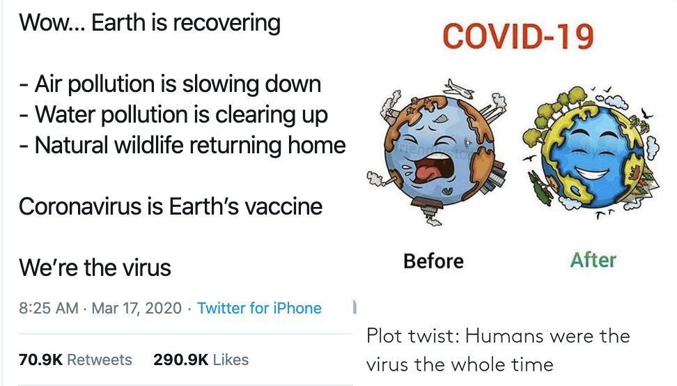
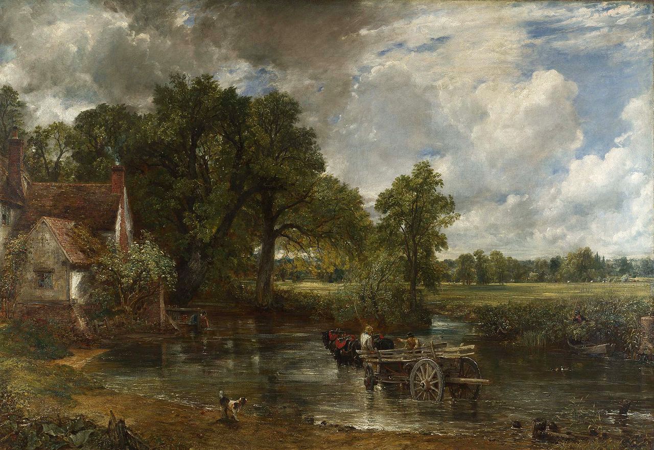
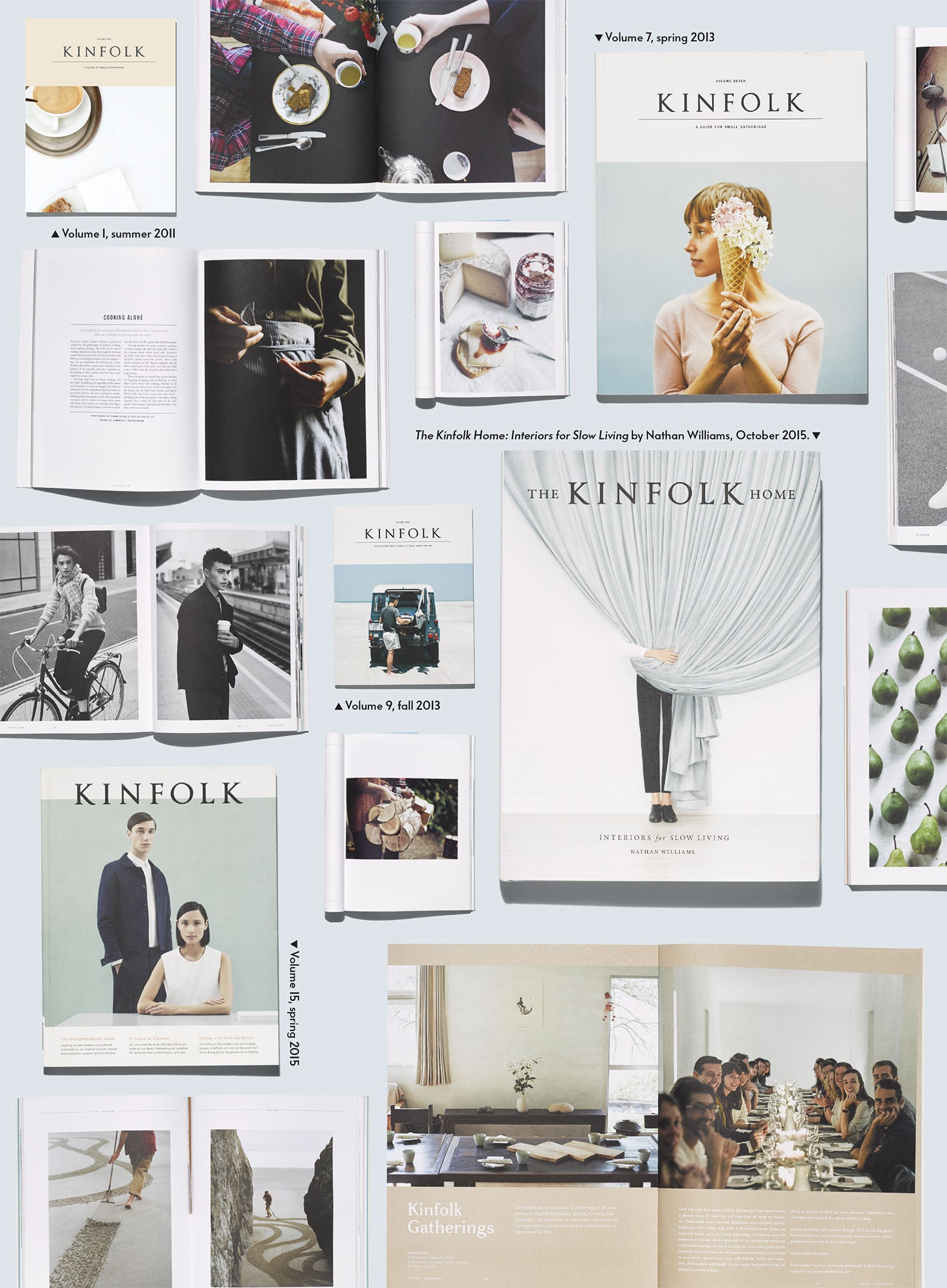
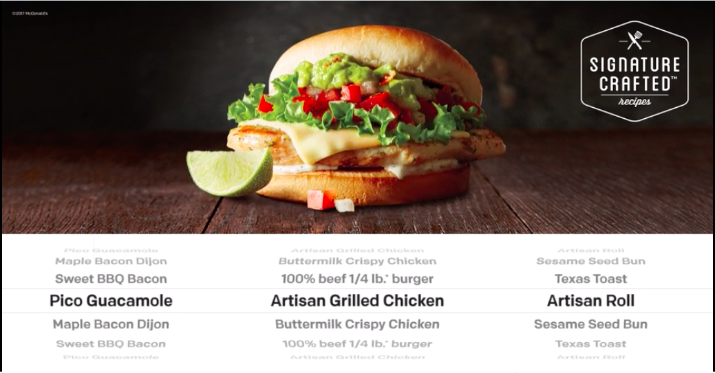
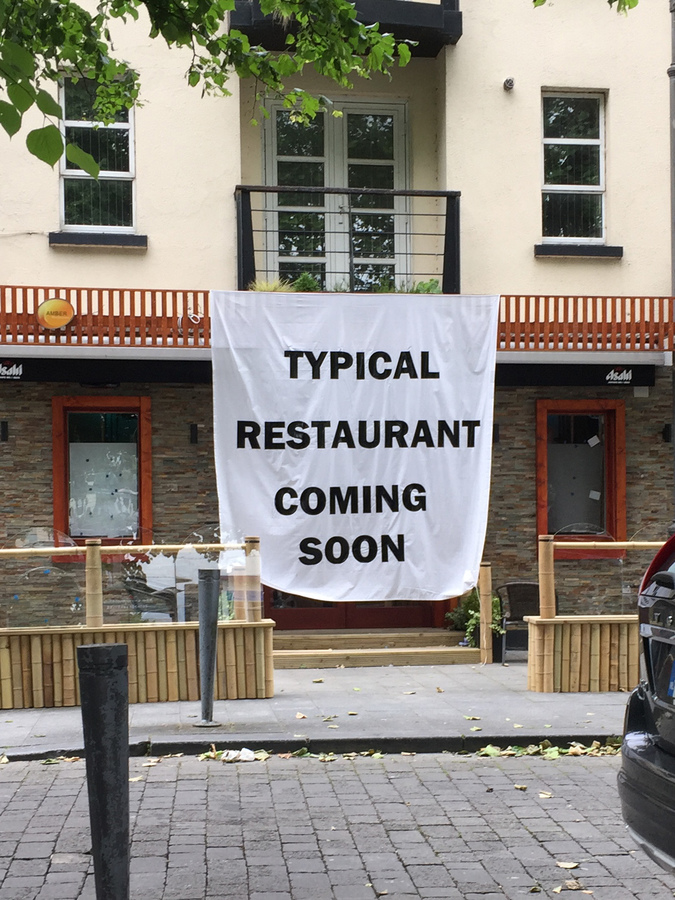
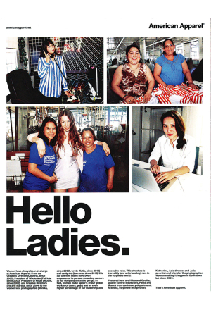
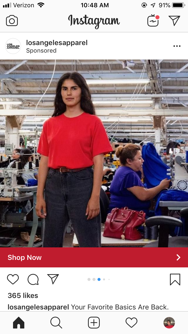
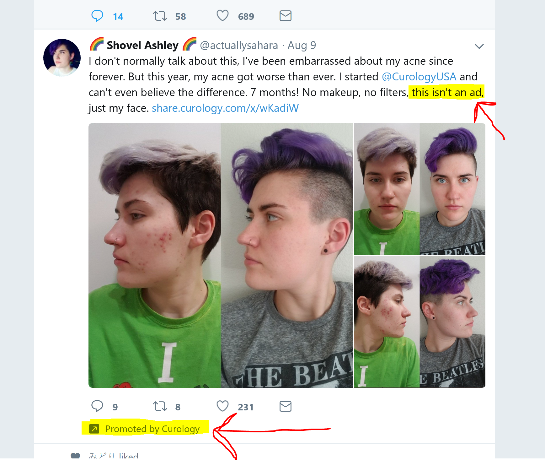
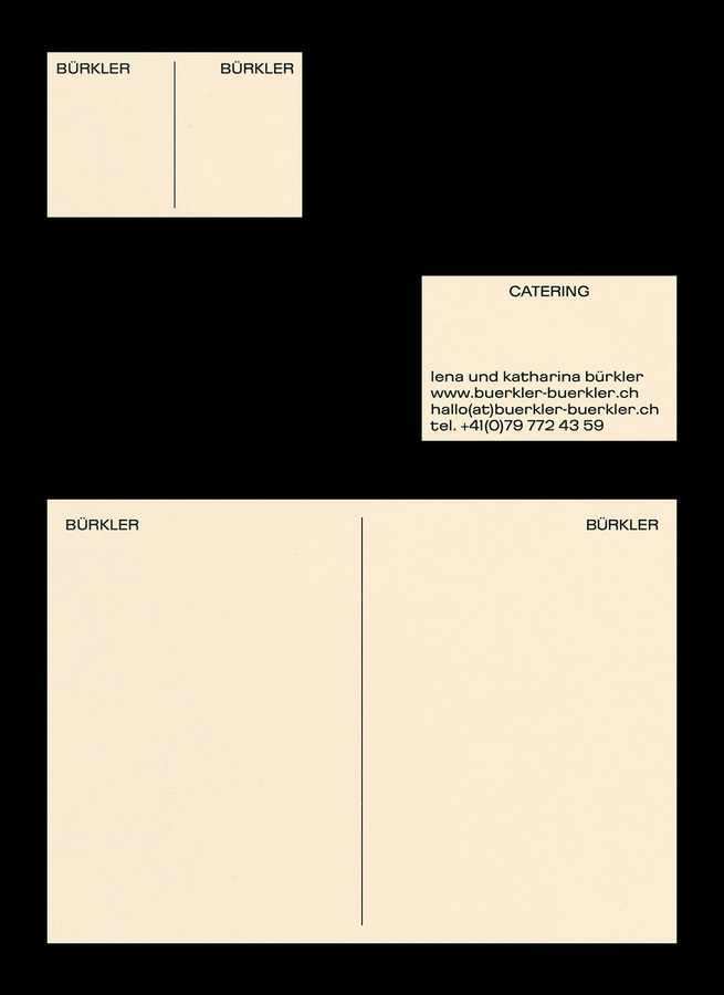
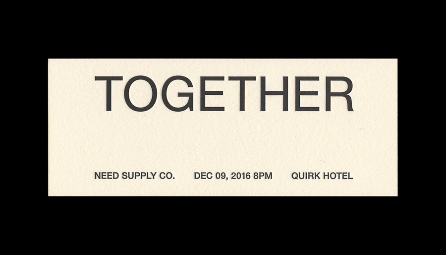
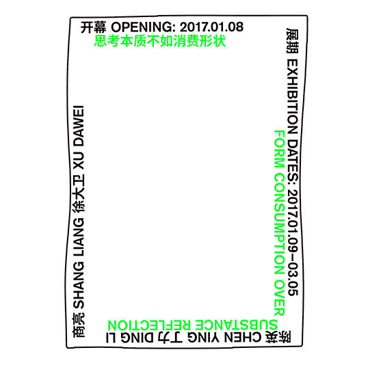
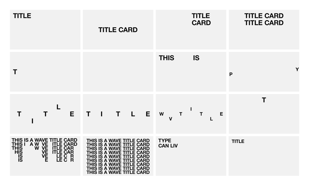
Some Premium Generic work that I admire

Various authors, First Things First 2000, From Emigre #51, 1999
A manifesto written to renew a 1964 version signed by a different group of prominent designers to "call for our skills to be put to worthwhile use," because "with the explosive growth of global commercial culture, their message has only grown more urgent."

“Self-organization education as one tool among many, which can be used to think through and act on these challenges. In order to do so we need to leave the factory, potentially by building our own school-as-exit. If we can’t leave, or decide to stay, we need to repurpose its machinery and organize ourselves appropriately.”
Jacob Lindgren, Graphic Design's Factory Settings

Maybe we practice lazy-defaults-design for the clients who ask us for “more, quicker, now” and expect nothing more out of us than passive mockup-generation, so that we can reserve our energy to engage in projects that need a lot of creativity, projects whose purposes are to widen, instead of seal, the cracks in the capitalist real, so that we might again feel the breeze of the outside.

Onward!

Like it or not, we’re always participating in commercial design. When we’re designing for non-jobs or non-clients, we’re still doing marketing work: for ourselves, for the institutions where we learned our methods. We may be always advertising, but we’re also “always already programming,” in the words of Melanie Hoff. It’s hard to feel like we have agency, but I think that’s partly because it’s hard to see how much autonomy we do have, how we already automate our creative processes. It’s also hard to see how default presets automate our processes when we think we are being original. Either way, we’re already used to thinking like machines, shrinking and inflating to follow parameters and conditions like algorithms. Saying that we have no agency makes us out to be innocent bystanders, as if the Modernist formal sensibility and prestigious rhetorics we’ve internalized from design institutions aren’t powerful or dangerous like computational code.
I’ve assembled some actions we can practice to help us navigate the post-authentic world in an appropriately normcore fashion, by rethinking adaptability, automation, and autonomy.